Overview
DriveCentral is a company that offers lessons to drivers in Philadelphia and its surrounding suburbs. However, DriveCentral's website organization and overabundance of boilerplate content makes it hard for users to navigate and find the right information. In addition, the sites branding did not appeal to the target audience.This is my proposed redesign of their website.
Users and Audience
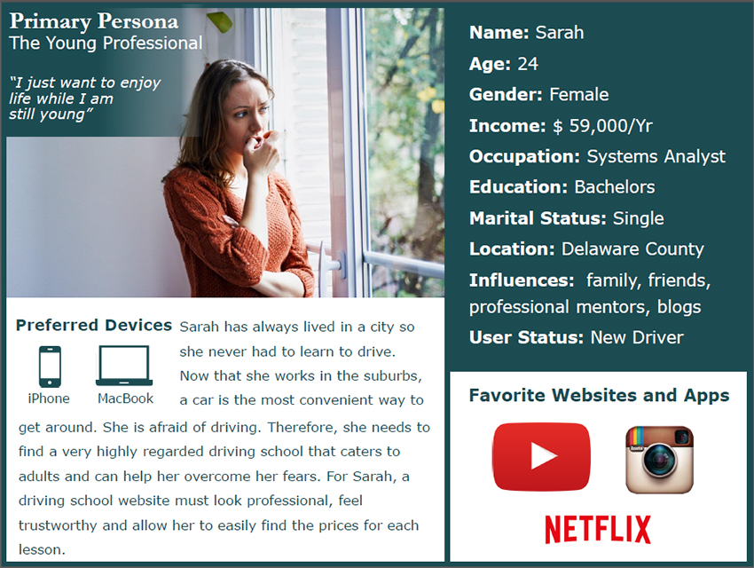
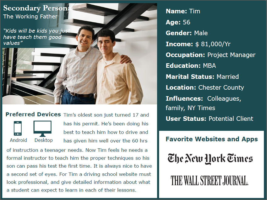
I was an actual student who learned to drive through this company. Therefore I had the opportunity to converse regularly with the instructor there. I was able to learn more about his business goals and who the target audience for DriveCentral was. He noted that his best clients were educated, responsible adults in the surrounding suburbs looking for lessons for themselves or their mature teenage children. Interestingly, he had just as many adult students as he had teenage students. I created the following personas based off some of the clients he described in our conversations.
- Persona Categories
- Ages 20-30 learning to drive for the first time or obtaining supplemental driving instruction.
- Ages 40- 55 with teenage children who are learning to drive for the first time.
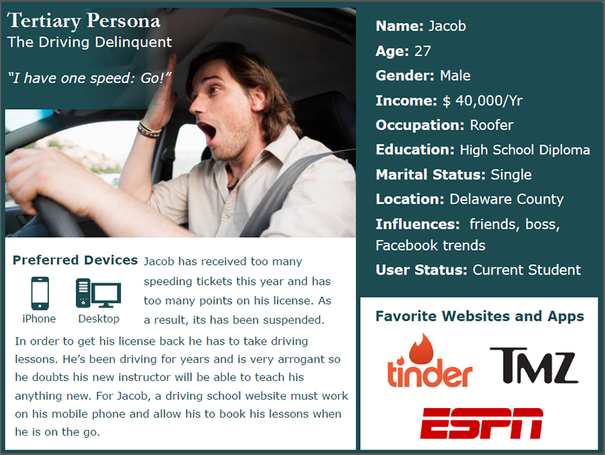
- Special needs cases: seniors, delinquent drivers, etc.
Research
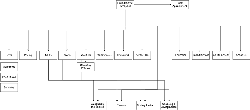
I began the project by completing a website audit. I created sitemaps of the current website's architecture.
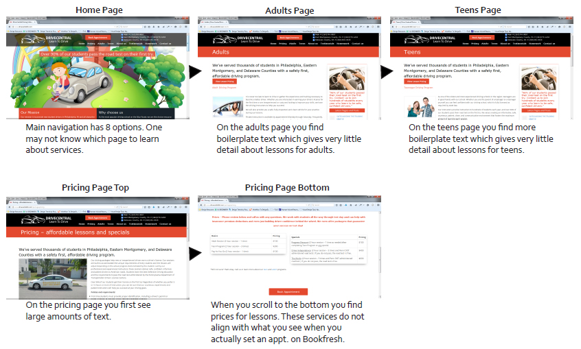
I then documented user flows for basic tasks and made note of usability issues I found along the way.
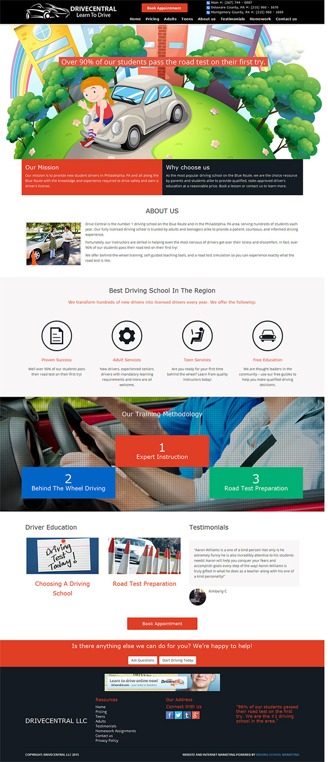
I also performed a competitive analysis of the websites of other driving schools in the area. By performing a Google search for driving schools in the philadelphia area I found that DriveCentral did not show up high on the list. Those that did, also had websites which were easier to navigate.
I also performed a competitive analysis of the websites of other driving schools in the area. By performing a Google search for driving schools in the philadelphia area I found that DriveCentral did not show up high on the list. Those that did, also had websites which were easier to navigate.
Strengths
|
Weaknessses
|
Opportunities
|
Threats
|
Given the many opportunities for improvement, I decided to focus on the Information Architecture of the site. The content needed to be organized in a way that was easier to understand.
I recruited friends, family and colleagues who fit the persona descriptions for user testing. I facilitated open card sorting sessions with them to see how people thought different pieces of content should be organized.
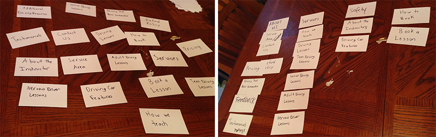
I compiled the results from all the session and found trends in how they organized the different terms.
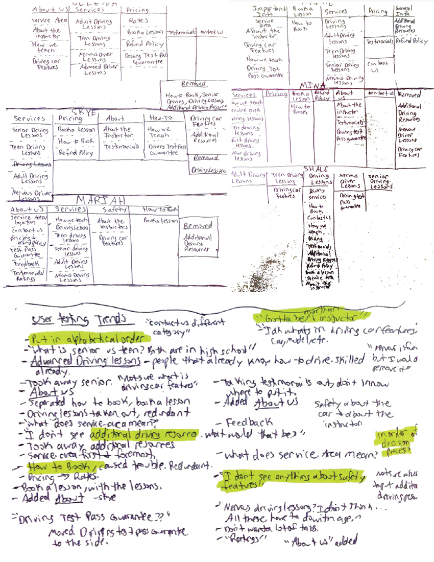
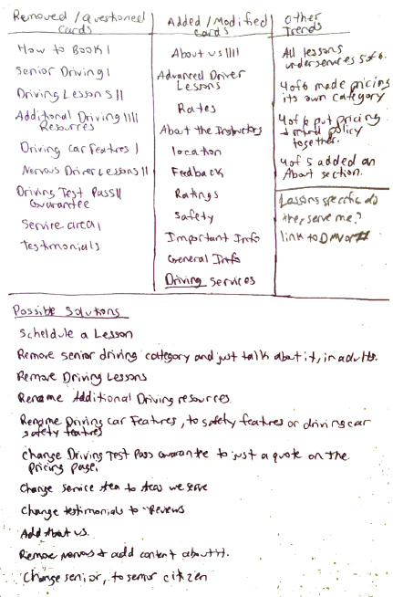
Here are a few of the many trends I found:
- 4 of 6 users did not understand what "additional driving resources" referred to.
- 4 of 6 users added an "About Us" section to the page, housing all information which they were not sure how to categorize such as information about the instructor and the driving test pass guarantee.
- All users assumed since it was a driving school, that there was more than 1 instructor
Based on this data, I experimented with new ways to structure the navigation for the site. Here is the first sitemap I created:
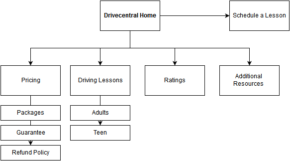
Based on the sitemap, I created the layout of the site by wireframing in Balsalmiq. After completing the first set, I tested the wireframes on a few users.
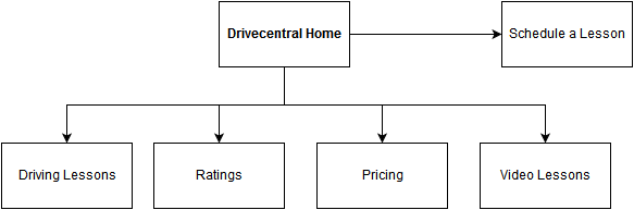
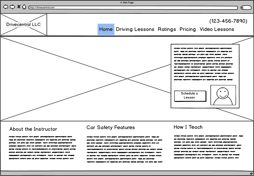
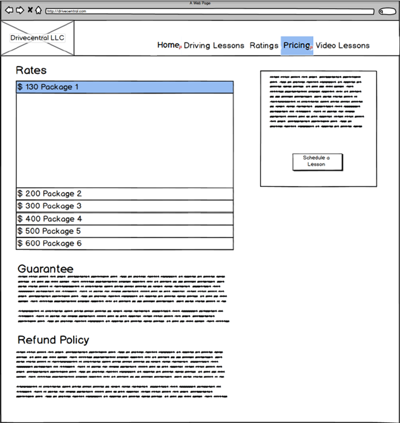
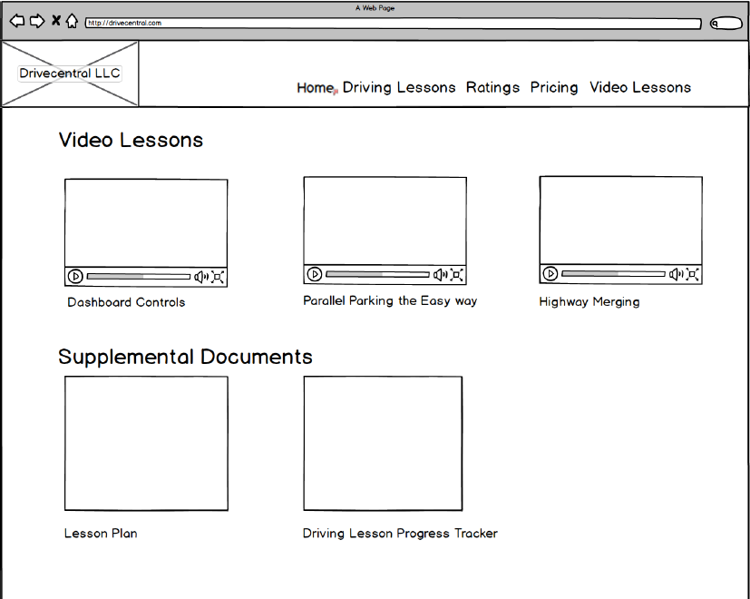
The supplementary materials DriveCentral provides to its students was the one thing that made the company unique. However, users were confused by the label "additional resources". Since the bulk of the supplementary material were youtube videos, I removed the other supplemental resources and just labeled the navigation item "Video Lessons". Users also did not understand what the label "packages" meant so i changed the label to "pricing". Additionally, I placed the guarantee and refund policy information on the pricing page. There was not enough content to deem that they needed separate pages.
UI Design
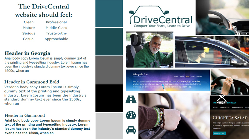
I created a moodboard which listed descriptions of how the site should feel to the target audience. I compiled all my ideas here for typeface combinations, colors and imagery. I even designed a new logo.
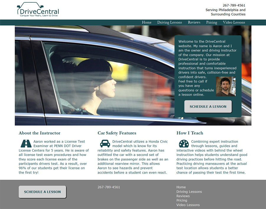
I designed the website using photoshop. Given the variety of backgrounds of the target audience, I decided to use UI design patterns which were common and users would already be familiar with. I've included just a few of the mockups below.
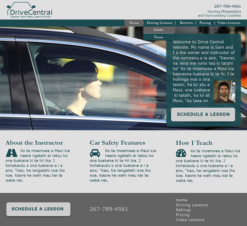
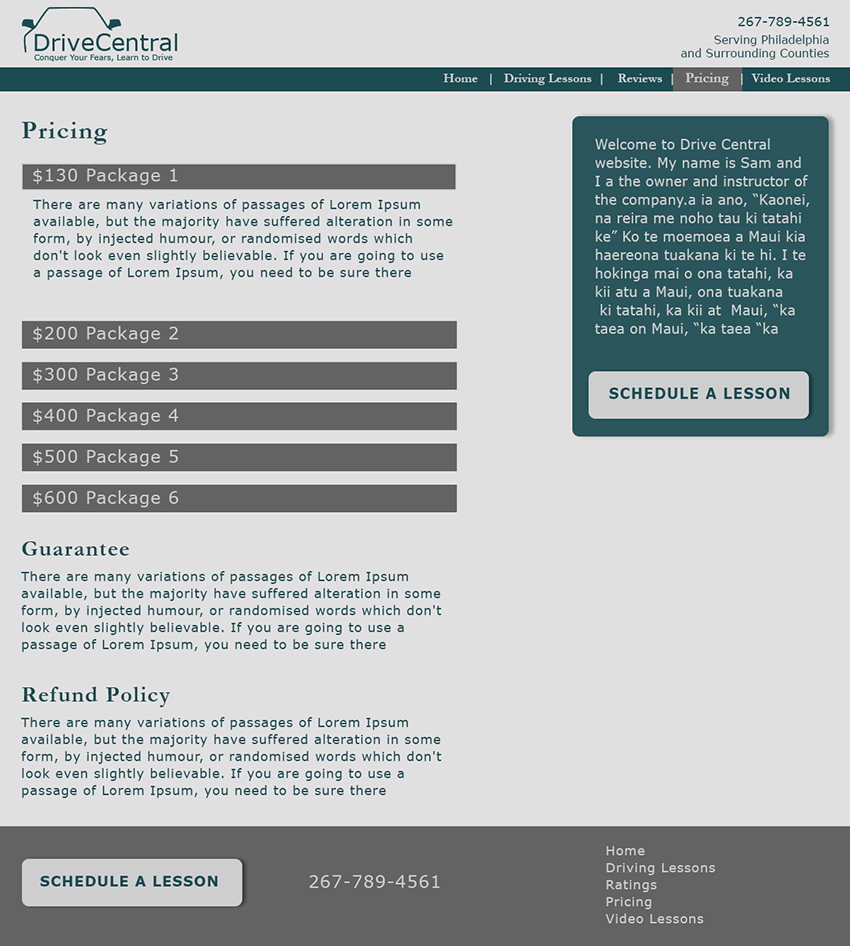
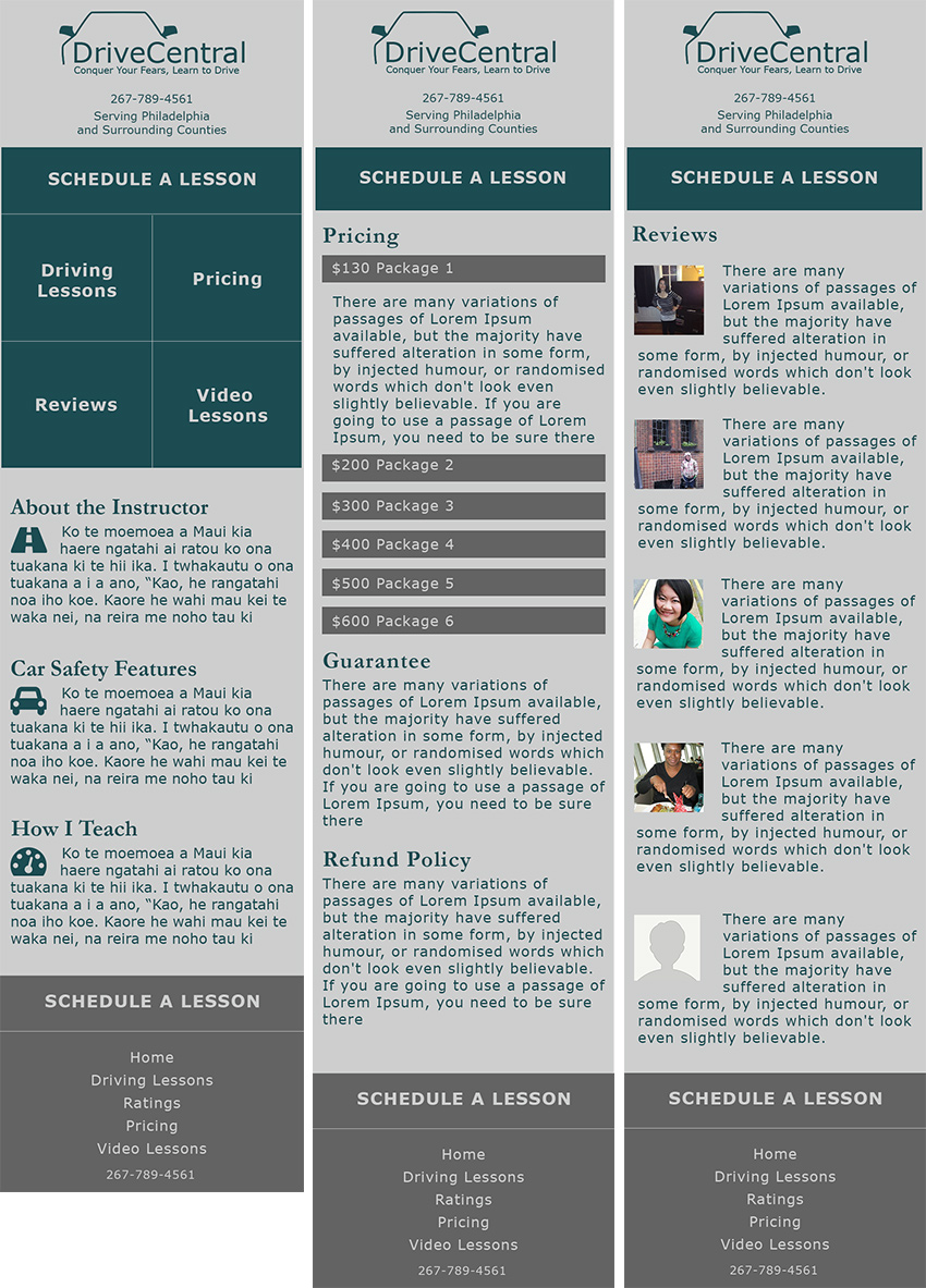
After doing some user tests with my new designs, I made small tweaks and began to build the site using HTML and CSS. See it working on GitHub
Results
Through another round of testing the prototype, I found that users felt the site was easy to navigate. When asked what each item in the navigation meant, the users had no doubt of what kind of content would be on the page. Moving forward I would find a way to incorporate more imagery to break up the text. Though the text is all relevant it isn't as inviting as it could be. Therefore, people may be averse to reading it. I would also need to improve the navigation on mobile. As it is now, the only way to get back to the main menu is by clicking on the new logo, which is not as obvious on mobile. I found the mobile design seems fits more for a native app, than the mobile version of a website.