Overview
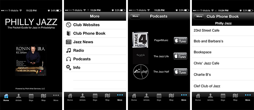
Philly Jazz is a native app which serves as a guide for Jazz in the city of Philadelphia. After downloading and trying to use it, I quickly found that it was not very usable, had broken functionality and its UI design had not been updated beyond the time of the first iPhone. This is my proposed redesign of the Philly Jazz app.
Research
I found more information about the types of people who attend live Jazz performances to better inform my app designs. I found this great study here:
Understanding audiences for Jazz Overview
Understanding Audiences for Jazz Briefing 2
Understanding Audiences for Jazz Briefing 8
Here are some key points about Jazz show attendees:
- Most attendees of live Jazz shows are older, with the average age being 42. Only 20% being under the age of 45
- They are usually educated and have diverse political views
- Some of the reasons they attend are to see a favorite musician, to discover unfamiliar music, or to see technical excellence for a specific instrument
- Attendees are more likely to be in a relationship
My next step was to talk to people to understand what functionality they expected in an app called "Philly Jazz". I attended a show at a local Jazz venu and talked to others in attendance. I showed them the app icon on my phone and asked them "what do you think this app does?"
I also interviewed people I knew who were interested in Jazz and other types of music as well. If a person was not particularly interested in Jazz, I inquired about their favorite genre of music. I would then follow up by asking them what kind of functionality they would expect to see in a local app for that type of music. Here's what I found:
- All users said that a local music app
- Should tell them about all the local venues for that type of music and who performs there
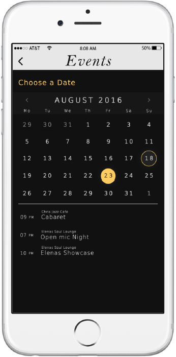
- Should tell them about specific events related that music genre A few users had other ideas like
- It should have a place to learn about the local artists and what instruments they play
- It should give updates about the local community for that music genre
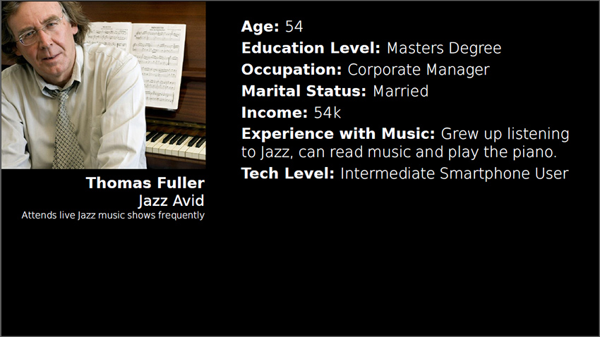
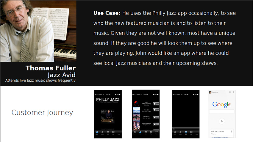
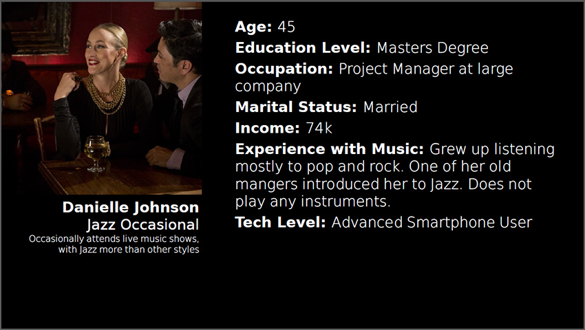
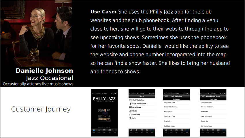
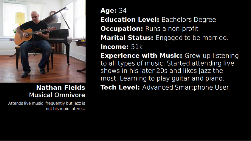
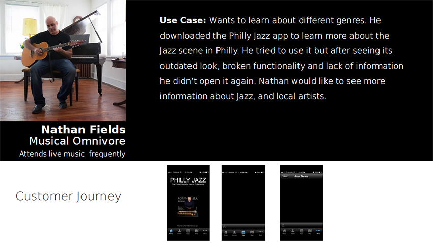
Based on the Jazz attendee study and the user interviews, I created personas to represent the people I met and their experiences using the Philly Jazz app.
Design
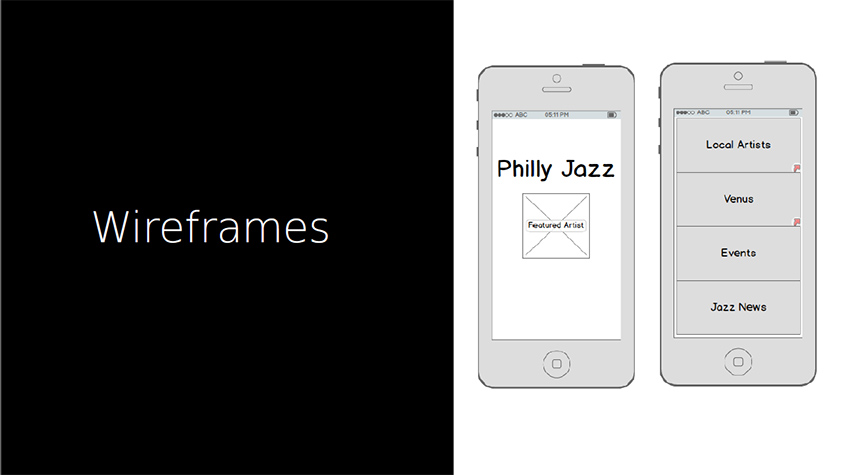
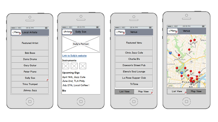
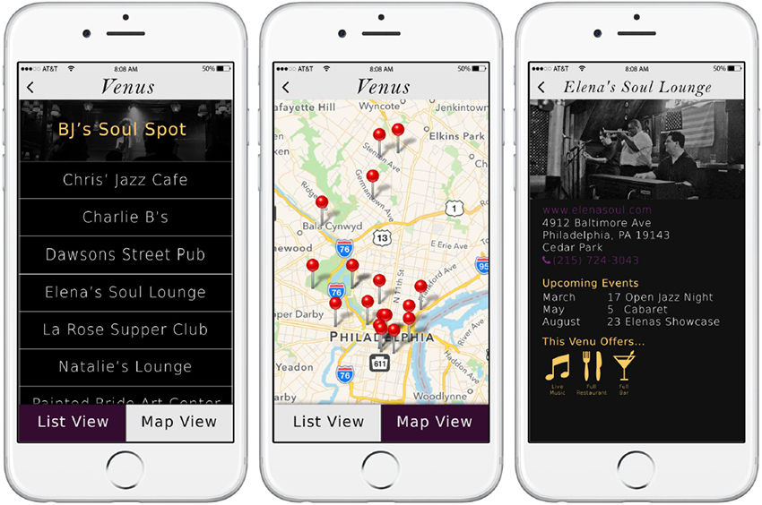
Next I built wireframes to think through the functionality and layout. Given the users of the app might be older I wanted to use patterns that were already familiar to them. Anything complex where users have to learn how to use the app would quickly make them abandon it.
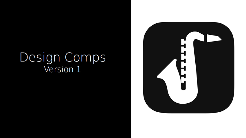
I needed to decide on typography and a color scheme for the visual design of the app. I asked different people to describe how Jazz made them feel and what Jazz "looks like". They used terms like:
"Upscale, clean, smoky room, dark, classy, smooth, brass, royal, sexy"
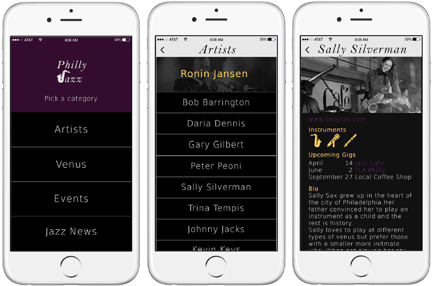
Based on this feedback, I applied different visual elements to fit these descriptions to my wireframes and developed my first set of comps.
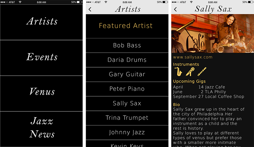
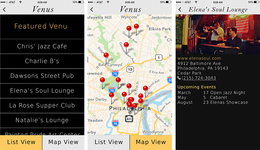
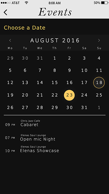
I asked a visual design professional for feedback and further refined my app design. To to make the app look more clean I reduced to font-size of the menu items. It feels less bold. I made the text more readable by changing the images to black and white and adding a transparent overlay. To make the menu look more like a home page, I added the logo and gave a bit of instruction to the users. I also added purple to the color scheme as a second accent color the differentiate clickable links from headings. Here are my second round of comps:
Moving Forward
I will create a prototype and test the design on real users. Using this feedback I will tweak the design and functionality and begin to think about micro interactions.