Overview
The SEPTA app is notoriously known for its hard to understand organization and functionality. Working in a team of two, we had 4 weeks to redesign part of the app to make it more user friendly.
Research
We only had a few weeks to complete our full design process, so we had to narrow down the scope and decide exactly what aspects we wanted to redesign. The SEPTA app is very complex and has lots functionality. To understand what users struggled with, we used a modified form of user journaling by reading reviews of the app.
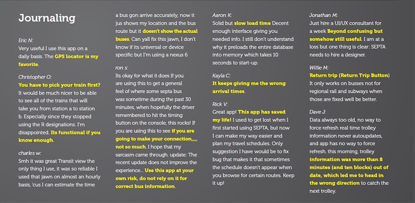
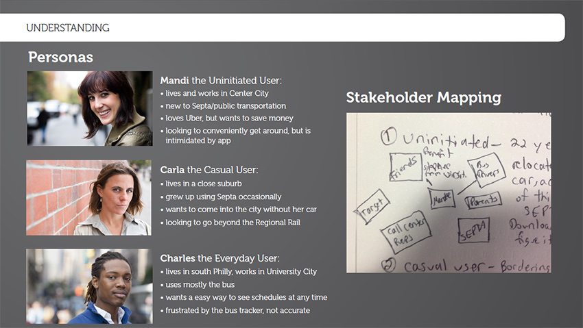
The comments were helpful, but not specific enough to be actionable. The reviews did not tell us enough detail about what tasks people struggled with. We needed to see real people using the app to understand what functionality in a transit app was most important to users. Based on the functionality available in the SEPTA app, we created a radar diagram. We gave students 3 different colored sticky notes. Of these options, they were to choose their top 3 functions that the SEPTA app should have. Then they would rank them in order of importance. The most important feature used red notes and were placed closest to the center of the diagram. The least important of the three were green and placed toward the outside of the diagram.
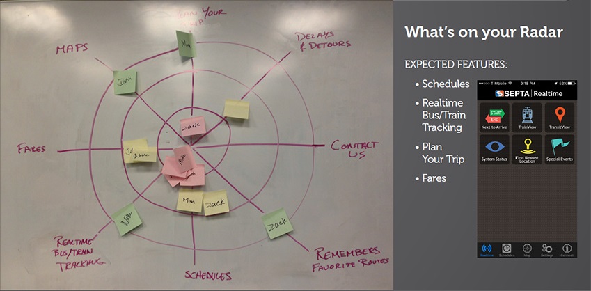
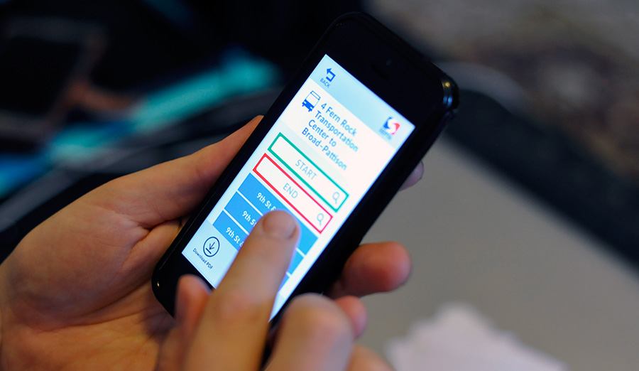
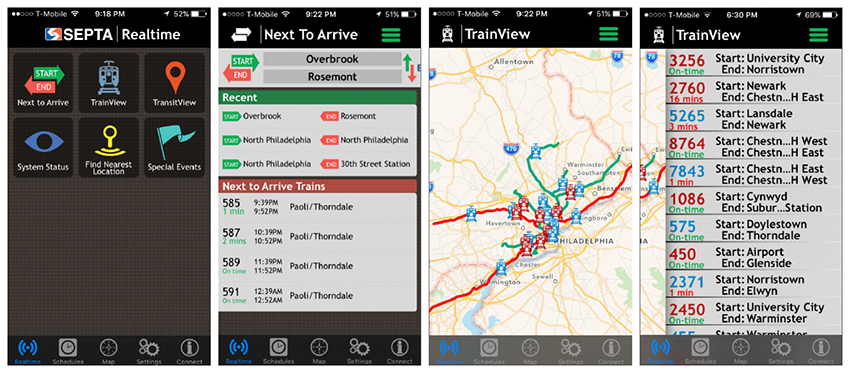
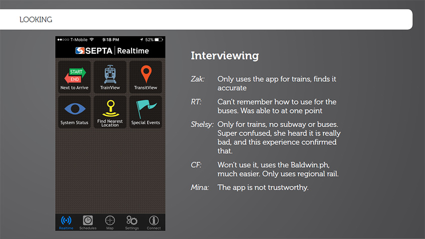
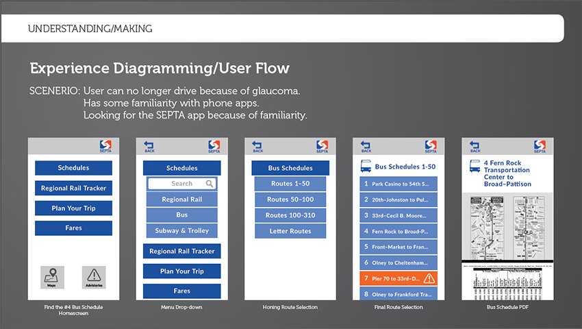
We found that schedules and real-time bus and train tracking were most important. People wanted know when a given vehicle would arrive to pick them up to reduce wait time. Given the similar goals of real-time tracking and schedules, we decided to focus on redesigning the user flow for having users find a bus or train schedule. However, we still hadn't seen anyone try this particular task in the app. Therefore, we decided to do some guerilla user testing of the SEPTA app. My partner and I asked random students around campus to try and find a schedule in the SEPTA app. Of the 5 users we interviewed all of them missed the schedule button in the footer, and could not figure out how to navigate the app. Users also didn't understand what the button labels meant, and when they clicked on them they were really confused about how to work the app.
After interviewing users we decided to use two more quick research techniques. The Rose, Thorn Bud technique was a brainstorming exercise where we noted things that were bad about the app, things that were good that we wanted to possibly keep in our design and things that had potential which we could build from.
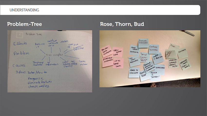
The problem-tree analysis technique helped us find the underlying cause of the complexity of the app.
- overload of verify similar features
- no onboarding on how to use the app
- confusing and inconsistent color scheme
- unclear labels and navigation
Our research showed that most of users troubles were because of the information architecture of the site. Users had trouble understanding labels and how to navigate the app. Therefore, we would make the most impact if we focused on these aspects of the design.
Constraints
Then our professors threw a monkey wrench a week into the project. We would also need to make our designs effective for people with the eye condition glaucoma.
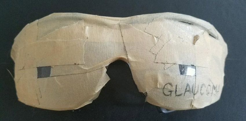
To get a better understanding of this particular user group, we started by researching online to understand the causes of glaucoma and how it affects people in their everyday lives. We also tried to simulate what it would be like to live with glaucoma so I ordered a pair of glasses to simulate glaucoma. While we waited for it to ship, my partner made a pair using old goggles and tape.
We each spent a full day going about our everyday lives using these glasses and kept journals documenting our experience (please note we did not drive or conduct activities which might put others in danger).
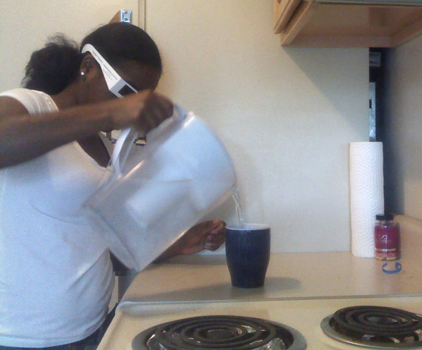
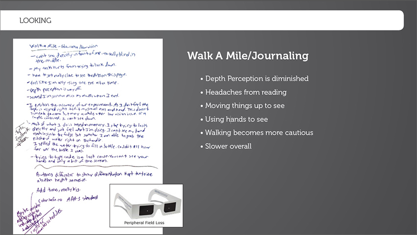
Things like reading and pouring a glass of water were difficult as my depth perception was off. I couldn't imagine trying to cook! Using any application on our phones were downright frustrating. We knew the SEPTA app was confusing and frustrating to figure out, but when we put on glaucoma simulating glasses, the app became almost unusable. Towards the end of the day many of my actions involved working based off memory and touch. Nothing seemed to be built with a level of usability in mind that suited someone with such a condition.
After this exercise, we noted what improvements the app would need to have to be more user friendly to those living with glaucoma.
- Text needs to be large and easily readable.
- Important information needs to be centered on the screen vertically and horizontally as anything on the peripheral might be missed initially.
- There needs to be significant enough contrast between text and the background.
Design
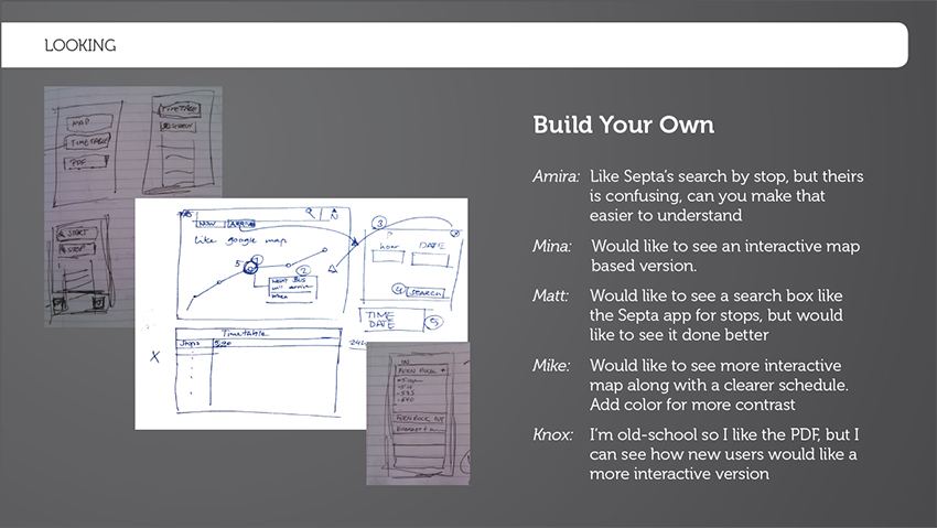
Next we began to sketch layouts ideas and move on to wireframing.
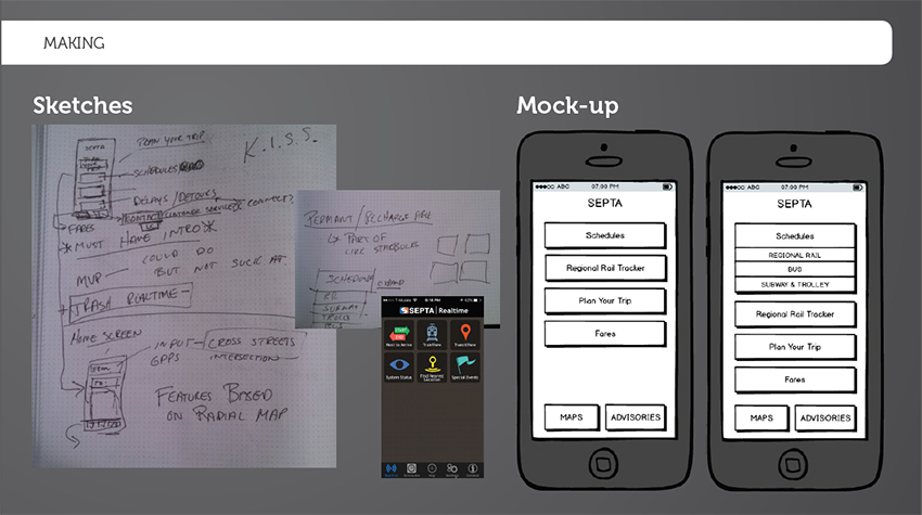
We removed functionality from the app which had broken functionality in the current app ,such as the real time train tracking. This decreased the complexity of the app by limiting the number choices from the main menu. It was challenging trying to think off clear labels for the buttons of our app. We used terms that we found in other map and transit applications, so that the terminology would be familiar. After deciding on the labels for the menu items, we began to apply visual design to the app. Given those living with glaucoma don't have peripheral vision, we went with a large centered layout for the menu. We referenced colorsafe.co/ to make sure that we chose a text size and color palette that met the AAA WCAG legibility standard. SEPTA has a common red white and blue color scheme. We did not want to use red in a high capacity because of the danger and warning connotations associated with it. Therefore, we chose blue and white for our menu. We placed two less important functions of the app at the bottom of the screen. However, their buttons were large and prominent enough that they would not be missed. Once we had our first pass at the visual design we used paper prototypes to test it out with users.
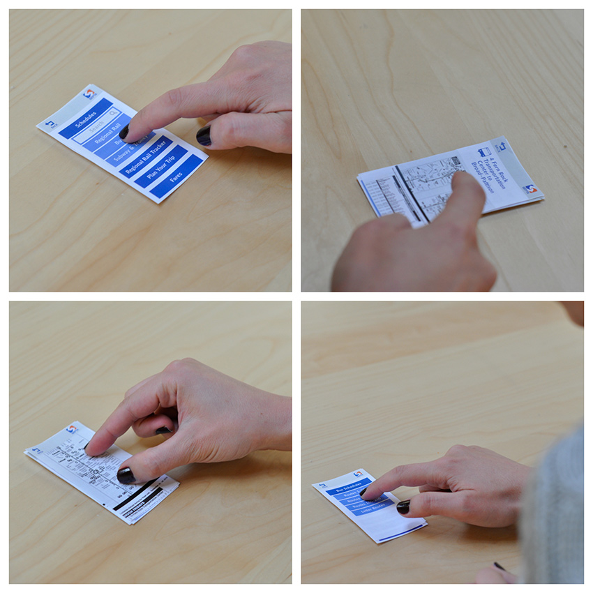
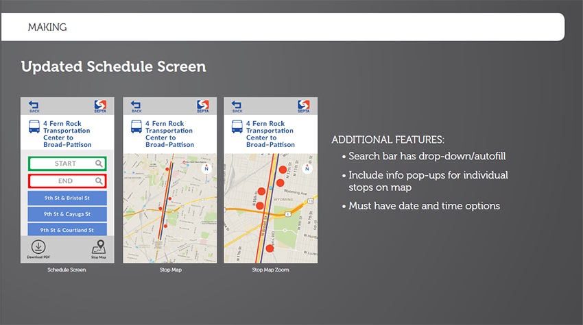
Users were happy with the menu, but they did not like the idea of the schedules being in PDF form and having to zoom and scroll to see the times. We got some feedback on how we could improve this.
Results
We revised the scheduling screen, created an interactive PDF prototype and had users test the app on a phone while wearing the glaucoma glasses.
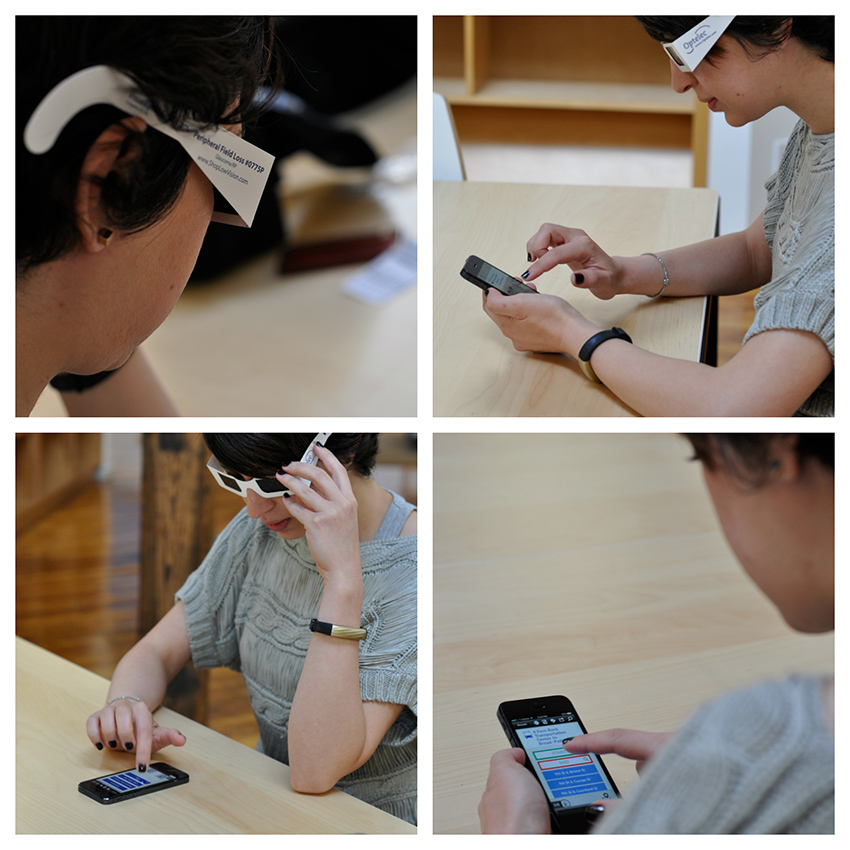
Though some users were not happy about the real-time tracking functionality not being available, everyone was able to use the app easily while wearing the glaucoma glasses. They also understood what the button labels meant.